How to design an omnichannel shopping cart page that converts
According to Statista, e-commerce sales exceeded $5,7 trillion in 2022. The design of an e-commerce site plays a major role in converting these sales, and each stage of the online shopping journey must be carefully crafted and optimised to lead to a purchase.
The order process must be simple and seamless. To achieve this, special attention should be given to the shopping cart page. It is a key element of the customer journey, and its optimisation can reduce cart abandonment, improve the customer experience and ultimately increase revenue.
The critical role of the omnichannel shopping cart page
According to the Baymard Institute, a research institute specialising in online customer experience, only 3 in 10 shoppers who reach the shopping cart page go on to complete their purchases. Several factors can significantly impact conversion rates, including:
- Additional fees: High delivery costs or taxes are the main reasons that discourage customers from finalising their orders.
- Long delivery times: Customer expectations for delivery have evolved. Shorter delivery times are now preferred, and a wait of 5 days may not be acceptable to customers in an era dominated by Amazon’s express delivery.
- Mandatory account creation: Requiring customers to create an account before completing a purchase can be a hindrance and may lead shoppers to purchase from a competitor offering guest checkout.
- Lack of website credibility: A website that does not inspire trust visually or has long loading times may prompt customers to abandon their carts for a site perceived as more secure.
However, abandoned carts can be saved:
- Reminder emails: Customers with a registered account allow brands to set up email reminders. Reminder emails have a higher open rate ( 45%) compared to typical marketing emails (15% according to Mailchimp). Additionally, Klaviyo reports that campaigns consisting of three reminder emails are even more effective than a single email in recovering abandoned carts.
- Retargeting: Reminding customers about the products they abandoned through retargeting ads can increase conversion rates by up to 150%, according to a study by Motocoms.
What makes a good omnichannel shopping cart page?
A high-converting shopping cart is straightforward and inspires confidence. This confidence is derived from three elements: the information presented on the cart page, available interactions and aesthetics.
An effective cart page should be complete and transparent, displaying the following information: item quantities, costs, multiple fulfilment options, delivery times, payment methods, instalment payment options, promo codes and the final price.
To make checkout even easier, customers should be able to interact with the cart page to make last-minute modifications, such as changing the quantity of items or removing them, entering a discount code, or simply saving the cart for later.
The appearance of the cart greatly influences the trust customers place in it, directly impacting the cart abandonment rate. Therefore, all information should be presented in a clear and streamlined manner, without overwhelming the page, and with colours that aid comprehension through contrast.
Lastly, a good cart page must consider the device used during the visit. Whether on a computer, tablet or mobile phone, the page must be responsive to adapt to all screens. It is especially important to optimise carts for smaller screens: according to 2021 figures from SaleCycle, 83% of carts are abandoned on mobile versus 73% on desktop.
An example of an ideal shopping cart page
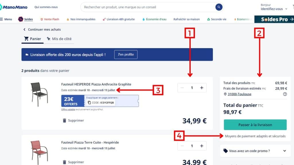
Home improvement retailer ManoMano uses the OneStock Order Management System (OMS) to optimise its shopping cart page.
The positive elements are quickly discernible:
| 1 – Product information: Images, quantity, unit price, total price, etc. – these details are necessary to allow customers to easily review their order before confirmation. 2 – Final price: The total amount to be paid should be clearly visible and should not hide any additional fees. 3 – Delivery Promise: OneStock OMS consolidates stock data to display all available delivery options directly on the cart page. Customers can access information such as delivery times and prices without needing to reach the end of their checkout journey, reducing last-minute cart abandonments. 4 – Secure payment methods: The cart page displays all available payment methods. Security is a significant concern when shopping online, so specifying that payments are secure reassures customers during the purchase process. |

Clear, simple and precise, ManoMano’s cart page is a brilliant example to illustrate best practices for offering a cart page that converts.
Discover how OneStock OMS can transform your shopping cart. Contact our omnichannel experts today.


